The most important, arguably, aspect of a video game is its box art. People say “don’t judge a book by it’s cover” all the time, but you and I both know that’s exactly what people do. If you aren’t dialed in, if you aren’t already aware of a game before you go in to buy it, you’re probably picking it up based on the evidence you have in-store, which is the stuff printed on the case. So of course it gets screwed up all the time. Here’s ten of my favorite examples of eye-rollingly horrible video game box art.
Irritating Stick (PS1)
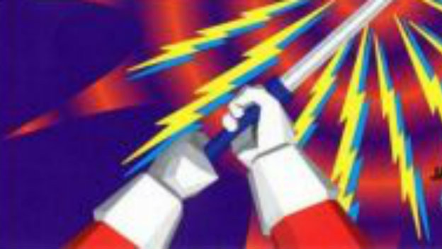
I mean, like, just look at it. Look at the title. Look at the image. It’s a pair of hands holding a stick. An irritating stick, apparently. Anything else about the game is anyone’s guess, but this normal-ass-looking stick is annoying, allegedly. It’s probably a cool puzzle game, but thanks to the most unimaginative box art in existence, nobody wants to expend the effort to find out.
Castlevania: Dawn of Sorrow (DS)
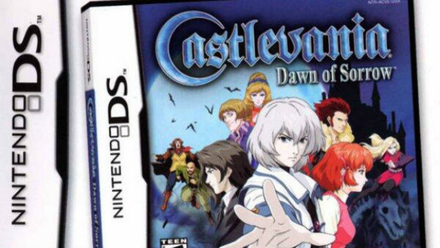
Castlevania: Dawn of Sorrow is an excellent game and had pretty straightforward box art. The original art showed off the characters, had the nice new logo, and was upfront about the short-lived anime style. But then, Konami re-released the game in an attempt to do a line of best-sellers, and uh, re-printed the box art, like literally. As in, the box, DS spine and everything, repeats itself within the normal DS spine.frame. It’s a box in a box. Why?
BioShock: Infinite (PC, PS3, 360)

BioShock: Infinite was a game that pretended it had something to say, only to lean on spectacle and boring sci-fi cliches at the expense of what could have been useful commentary on American exceptionalism. So appropriate that its boxart is the most last-gen, sad white dude cradling a gun in front of photoshop effects cover of the generation. It’s almost a drift into parody, it’s so corny. But in reality, it’s just as aggressively vapid as the game inside the case.
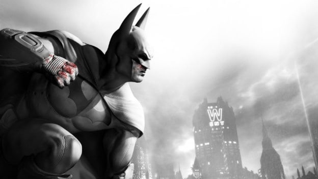
Batman: Arkham City GOTY Edition (PS3, 360)
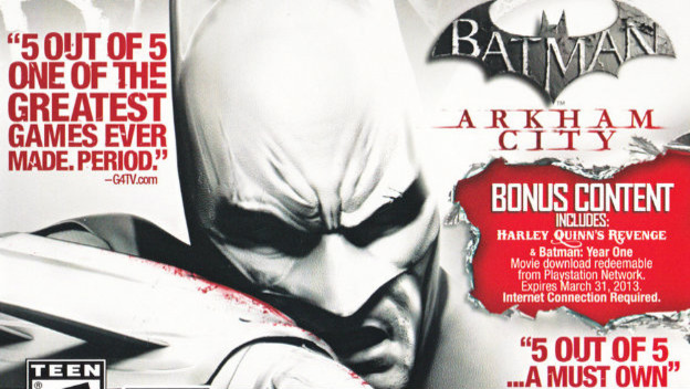
Oh good lord, dig my eyes out with a spoon. Yes, we get it, people liked Batman: Arkham City . Magazines and websites had nice thigns to say about it. Good job! But why on Earth did we need to splatter pull quotes all over the box? Anyone who looks at it and tries to focus is going to immediately start bleeding from their head orifices. Ugh.
Gex 3: Deep Cover Gecko (PS1, N64)
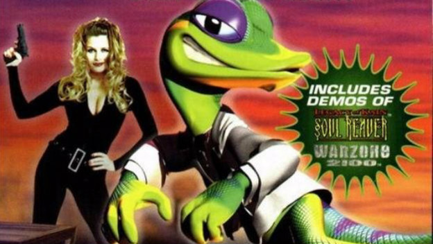
It’s one thing to have an animal mascot; that’s fine. It’s one thing to have an edgy, 90’s animal mascot; sure, why not? But can we not have a badly-shopped, sexy woman whom we are implying wants to bone the cartoon lizard man? Can we just not, please? Gex was the worst, man.
The Guy Game (who cares what system this was on?)

Oh look, it’s an affront to human decency in a box! I’d love to be a fly on the wall back in the meetings leading to this game’s introduciton, acceptance, then development. At any point did anyone think this game was actually a good idea? At any point, did anyone speak up about how dumb it was? Did the graphic artist responsible for the cover get paid in real money? None of these questions will ever be answered.
Karnaaj Rally (GBA)
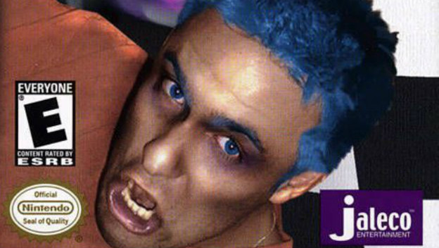
It’s hard to say anything about Karnaaj Rally that hasn’t already been said by Seanbaby. I will say that this box may be the best use of the Nintendo Seal of Quality in the history of Nintendo games. Just look at it sitting there, gleaming, right next to a Photoshop nightmare.
Strider (Sega Genesis)
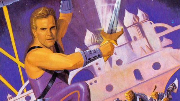
Strider is a dope series from Capcom about a dope anime/robot ninja who jumps on/off walls, throws shurikens, has cool robot animals and eventually even shows up on the PS4/Xbox One in a cool, modern Metroidvania game. So of course in the 90s, S trider looks like Mr. Perfect posing as the star of a 70’s sci-fi show. Poor Capcom.
Pac-Man (Atari 400)
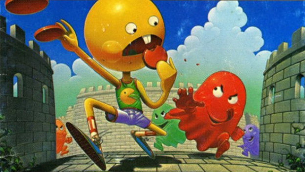
It’s hard to mess with the likes of Pac-Man. But if you want to see the peak example of how to succeed in messing Pac-Man up, check out the version released for the Atari 400. Now, at this point, a house style for Pac-Man wasn’t nailed down yet. If you look at the original Japanese Puck Man cab, you see something similar to what we know now, but that didn’t make it stateside either. So when it came to Atari, which was a mistake anyway, we end up with this humanoid abomination.
Mega Man (NES)
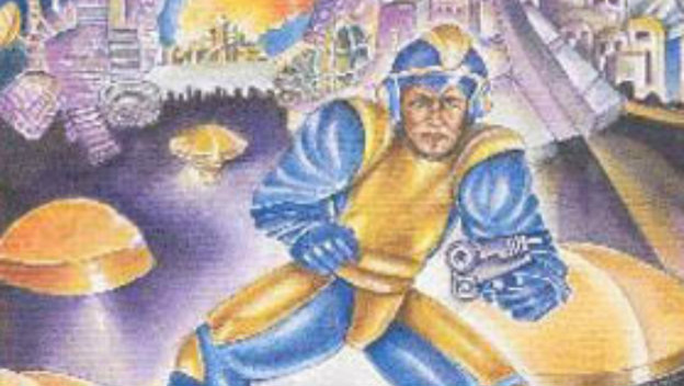
You shouldn’t be surprised to see this here. Are you? Capcom just couldn’t catch a break for a long time. I’d love to look more into the licensing process for games sometimes, to see if reusing box art was a rights issue, or if American publishers were just run by fools. Anyway, here we are, with the original Mega Man looking like some kinda Wal Mart Buck Rogers-looking disaster printed on the box. Of course when you turn the game on, Mega Man is still a cute, little anime boy. Luckily Mega Man righted the aesthetic ship after a few releases.